The recent months have been full of Christmas card design projects. For this card I was tasked with creating a design based on the same influences I’m grappling with in my personal work, and I went in quite an experimental direction.
My brief to myself was to create something in the same mode as my Central Park series, with data and a pen plotter, but using festive data and themes. We did some brainstorming and the concept that felt most intriguing was to look into data on the various Christmas tree lots that pop up around New York. I associate these lots quite strongly with the holiday season in New York, and having just moved back to the city it seemed like a timely focus.

I began researching and quickly learned more than I ever thought I’d know about Christmas tree lots! It seems that Christmas trees specifically don’t require a permit to vend, which explains their great proliferation in New York around the holidays—but also means there’s not a lot of easily accessible data on them. I found some homegrown maps of lot locations, but simply geographic coordinates isn’t quite enough data to draw something interesting. I decided to make my focus more personal.

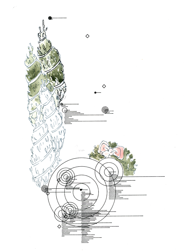
To diversify my data types, I turned to Yelp reviews. I took all of the locations they listed as tree lots within the five boroughs, though I had to discard any that weren’t blessed with ratings or reviews (I don’t yet have a great way to illustrate the doubt inherent in a null value). For each of the places I found, I listed geographic longitude and latitude, rating level, and number of reviews.
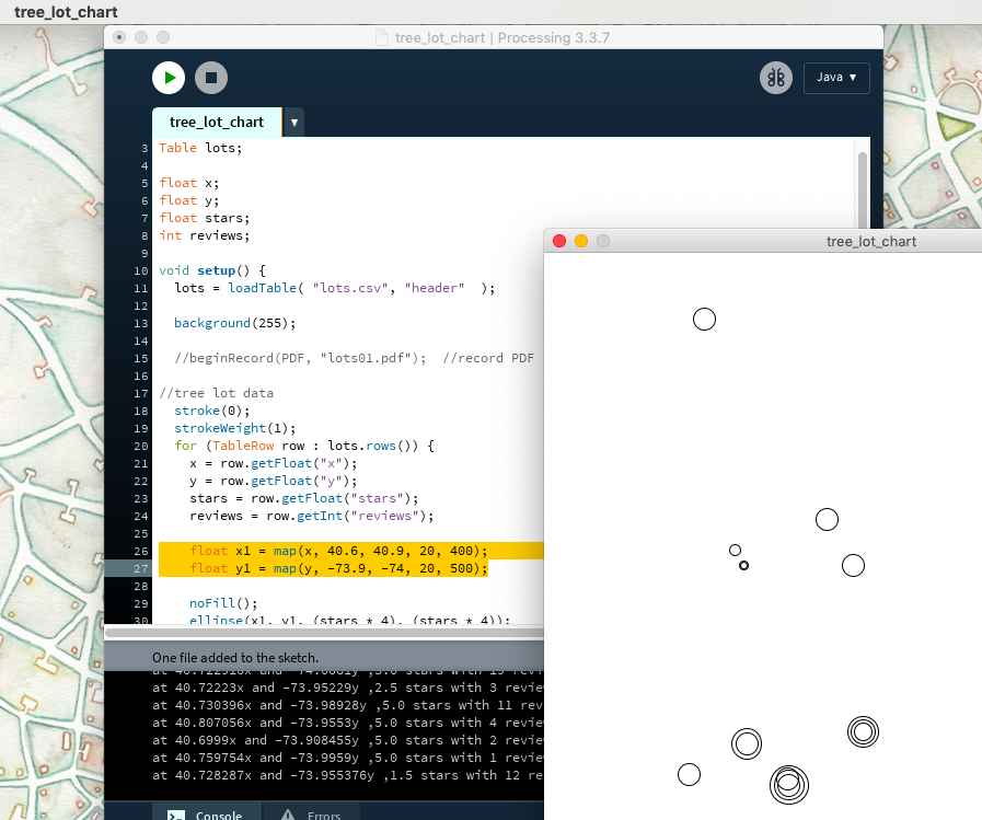
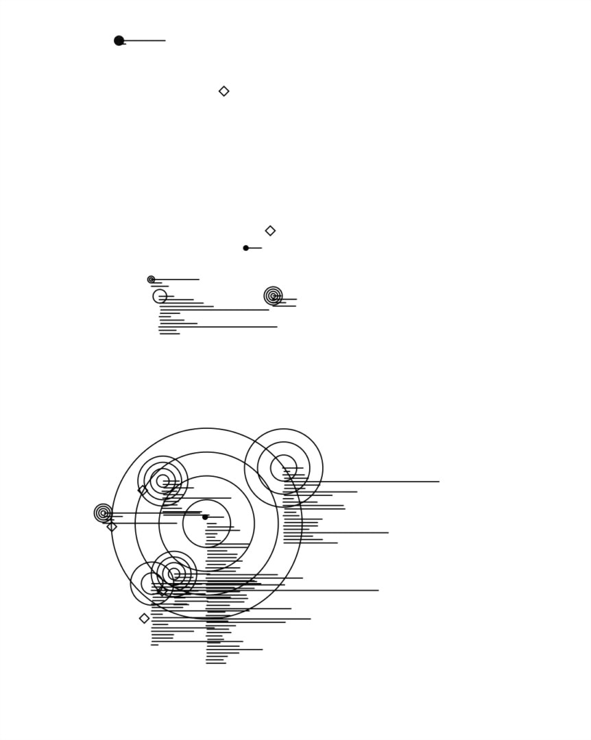
I then pulled the data into a Processing sketch and wrote code to display each place as a circle at its geographic longitude (y) and latitude (x), scaled based on how many reviews the place got, and with additional circles based on how many stars the place had on Yelp.
Note that you can’t just plot the coordinates directly as they are; the image goes from 0 to 700 on the x-axis, and 0 to 800 on the y-axis; and the coordinates go from 40.6 to 40.9 on the x-axis and -73.9 to -74 on the y-axis (it’s a small geographic area, relatively speaking!). This is where the map(); function in Processing comes in. In some ways, the bulk of the code is actually just adjusting input values to match the vision. (That may in fact describe all code).
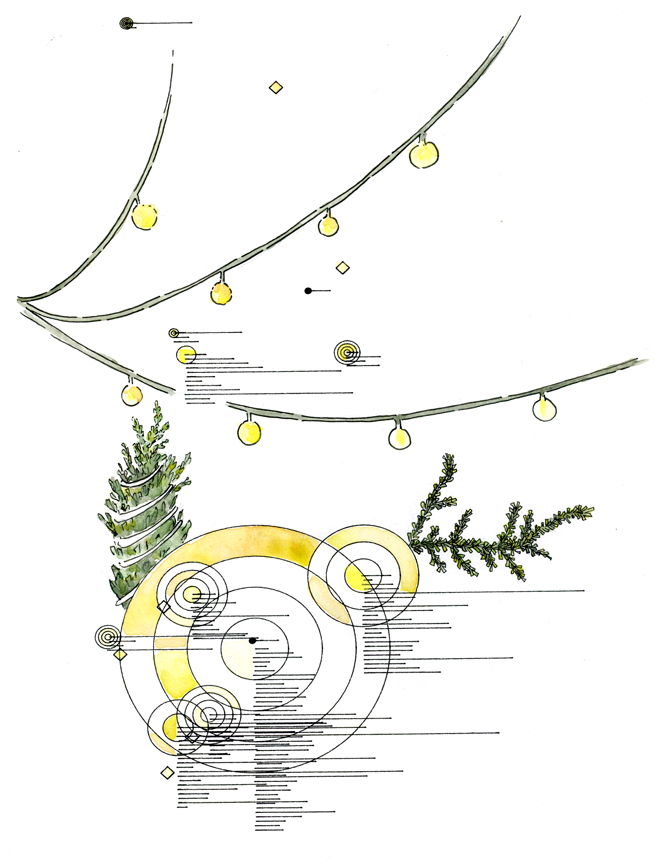
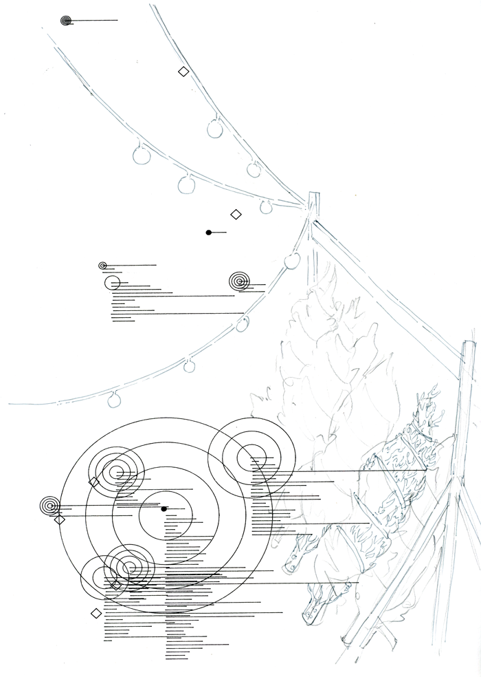
I did some test plots of this data with the axidraw, but while the results resembled my Central Park series, I wasn’t sure I could work with them. I wanted to focus on more illustrative, less repetitive elements like the ubiquitous string lights and the wrapped-up trees, and I was concerned the data would get lost amongst the illustration. I decided to go with an image that provided enough visual information to be intriguing, and build the illustrations around that. I went back to Yelp for more information.
I’d saved the link for each listing with its data, so I went back to the listings and fleshed out the spreadsheet with not only the number of reviews, but the word count for each one so I could plot them as lines extending from each site. This form references writing while staying abstract.
Once the code was set, I ran it to render a PDF and then set the axidraw to draw from the vector image.
I used waterproof Micron pen on watercolor paper, so I was able to watercolor directly on the plotted image. I tried various ways of incorporating the essential elements of the Christmas tree lots: the bound trees and the electric-generator lights.
The final image was subtle in a way that was almost mysterious. I focused on the abstract forms of the lights, incorporating some yellow reflections in the pine drawings as well, and the printer reproduced the color wonderfully. I’m impressed with how it came out! The cards are available on Etsy through the holiday season.